
Fully customizable button
Alexander MartinThe AlexaButton component is a component optimized for different viewport profiles, which is unfortunately difficult to customize in terms of styling.
This document shows a self-made reusable customizable button component.
Custom styles and styled properties can be used to change the look of the component, the component itself is quite simple, the source code is also accessible via the import URL.
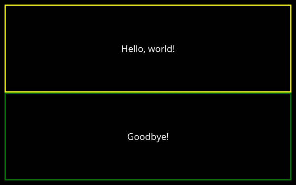
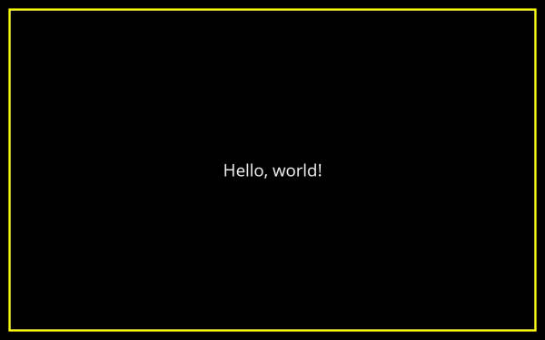
By default, the component uses these style definitions: ButtonTouchWrapper, ButtonFrame and ButtonText
The names of the styles to be used can be overridden via the properties: touchWrapperStyle, frameStyle and textStyle.
Since the component is actually a TouchWrapper the documented onPress property can be passed.
DownloadOpen in Editor 12
12 422
422 0
0 1
1
1242201Share
Supported Viewport Profiles
 Mobile Portrait, Small
- Mobile Landscape, Medium
- Mobile Landscape, Large
- Hub Round
- Hub Landscape, Small
- Hub Landscape, Medium
- Hub Landscape, Large
- TV Fullscreen
Minimum required APL version1.6
Related documents


 12
12 257
257 0
0

More from Alexander Martin


Comments
Be the first to comment.